New Site 新的网站

Hi everyone! I am happy to announce I have a new version of this website. It is a new iteration of the website. Most of the old articles will still be here, and the new articles will be published in the new website here. You can find several new articles there now, and some of them are actually published months ago. One of the article is related to a major update of WriteTeX. For further update of WriteTeX, please also refer to new website. Clearly, the new website is not full functional, and more updates are on the way. Welcome to visit the new website @ whyhow.github.io.

WriteTeX最终版发布

紅玉道:“也不犯著氣他們。俗語說的好,‘千里搭長棚,沒有個不散的筵席’,誰守誰一輩子呢?不過三年五載,各人干各人的去了。那時誰還管誰呢?” 《红楼梦·第二十六回》

Release of WriteTeX v 1.00

Everything That Has A Beginning Has An End. From “The Matrix Revolutions”

打假:印度是强奸之国

背景

今天又看到有人吐槽印度是强奸之国,想想上次这事发酵的时候到现在已经快半年了,当时很多很有“知名度”的节目也是吐槽一地。其实我和乙寅当时就很奇怪印度官员既然已经给出了一组明确的数据,为什么没有人去考察相关的数据,而是直接就上来一顿嘲讽。下面让我们来回顾一下这个事件吧。在网上随便都能搜到那个事件的导火索,比如印度官員:性侵案數量其實全球前四低印度官員:印度強姦案數是世界最低4個國家之一或者来自搜狐的印度女部长:印度属于强奸案最低4个国家之一,大致内容是:

印度婦女及兒童發展部的女部長馬內卡‧甘地(Maneka Gandhi)週一(21日)舉行一場女記者聚會,她在會中表示,印度的強姦案件數量,是世界上最低的4個國家之一,瑞典的案發數第一。

然后网上就出来了各种讨伐文章,在这里列举几个,网上要找的话可谓不一而足。

比如,来自搜狐的: 网友快评:印度强奸案发生率最低 我差点就信了

这个好像还查过资料一样,其中内容不乏:

她说的没有错吧,人家说的强奸率,人家人口基数大啊,一天一万起强奸除以十四亿貌似也只是个小数

替瑞典喊冤“瑞典政府和人民无辜躺枪。

总算知道印度为啥是强奸大国了,因为连那里的女人都不把强奸当回事

其实关于印度是强奸之国的论断很早就有,这里是一个看起来很严肃,做过仔细调研的印度如何沦为"强奸之国"文章,其中不乏煽动性的数字:

数据也证实了这点,根据印度国家犯罪记录局的数据,印度记录在案的强奸案件由1971年的2487起增至2011年的24206起,增长率为873.3%。比较而言,谋杀案件在从1953至2011年的近60年间里的增长率为250%,远不及强奸犯罪率的飙升。 平均下来,在印度每3分钟发生一起针对女性的暴力犯罪,每22分钟就会发生一起强奸案。在印度性犯罪最严重的主要城市新德里,平均每18小时发生一起强奸案,被冠以 “强奸之都”的耻辱称号。

按照一般的理解,作为一个国家的高级官员,说话完全不着边际的可能性是不大的,特别是还列举明确数据的话语。但是如果你真的去查的话,很容易找到的一个条目是中文维基百科的条目,不过不用太多的分析就应该可以发现那个页面的数据是错误的(这个大家自己去分析吧)。所以,我就稍微多检索了一下,很快就能发现联合国药物与犯罪部门公布了性犯罪的相关信息。很容易核对这个表格中的数据和上面文章提供的数据是基本吻合的,应该说也是比较可信的。

分析方法

考虑到不同的国家人口差异比较大,使用每十万人的案件发生数量是比较合理的选择。而像中文维基页面中使用所谓的一个国家每分钟的的案发次数是并不合理的。正是上面说的“人家人口基数大啊,一天一万起强奸除以十四亿貌似也只是个小数”,这话虽然是明显的讽刺,但是确实不加,如果是“一天一千起强奸除以一亿”,不知道这个发言者真的觉得前者比较危险吗?所以我们以下分析的都是每十万人在一年内发生强奸案例的数据。

同时,不同地区之间性犯罪案件的发生件数和登记在案的发生次数也是存在差异的。这一点并不假,特别是在具有“传统美德”的某些国家这个数目更是可能不算小数。但是无疑对于真实的犯案数量和报案数量之间的差异的估计是非常困难的,一个可行的方案可能是认为地理位置和文化相近的区域的这一比例也比较接近。同时,在没有可靠数据的支撑条件下,我们也不应过分夸大这一比例在不同区域的差距。下面让我们开始真正的分析吧!

均值分析

作为标准的分析的第一步,我们先看一下全球的平均水平。几点特征可以注意到,首先每年数据的均值都远过于中位数,其次标准差(SD)对于给定也数据很大,最后整个均值特征量基本是稳定的,没有明显的增长或降低趋势。平均罪案率大概在万分之一。

globalmean <- rape %>% 
  group_by(Year) %>% 
  summarise(mean=round(mean(Events,na.rm=T),2),
            median=median(Events,na.rm=T),
            sd=round(sd(Events,na.rm=T),2))

发展才是当代中国的第一要务

最近政府工作报告很火,最近大数据也很火,最近数据挖掘还是很火,所以不跟跟风刷刷存在感似乎自己已经落伍了。

路面粗糙度的模拟

最近弄一些和路面粗糙度相关的东西,想用粗糙度来进行一些数值仿真,找了半天都没有找到合适好用的代码,不是太复杂,就是各种运行不成功。索性自己写一个吧,描述的路面粗糙度的标准是ISO 8608,对应的欧标是BS 7853。标准里没有给具体的实现方法,只有空间谱的大小。所以查找了一下文献,发现了下面这篇文献定义了一个直接使用ISO 8608给出的路面谱的方法:

How to parallelize 'do' computation in dplyr

Introduction

Recently, I took apart in the IJCAI-17 Customer Flow Forecasts. It is an interesting competition in some extent. The datasets provided include:

  1. shop_info: shop information data
  2. user_pay: users pay behavior
  3. user_view: users view behavior
  4. prediction:test set and submission format

Because the nature of this problem is to predict time series, methods specifically designed for this task should be tested. The well-known ones include:

  1. ARIMA series models
  2. ETS series models
  3. Regression models

And it is not hard to find out that customer flow is a seasonal time series. Therefore, time series decomposition such as X12 and STL may be useful tools in analysis.

Preprocessing

The datasets include plenty of information such as the user_id make a payment to shop_id at time. Because the goal is to predict the flow of each shop and it is hard to build a user_id profile based model with only this amount of data provided, a shop_id profile based solution appears to be a better choice, i.e., we will build a model for each shop, and do the prediction. Therefore, for the preprocessing, the user_id should be aggregated. This is a pretty entry level task for dpylr(R) or pandas(Python) user. Therefore, I do not share code for this part, the results are organized as following dataset:

library(psych)
summary(tc2017)
##     shop_id       time_stamp             date_week         nb_pay      
##  Min.   :   1   Min.   :2015-06-26   Monday   :86544   Min.   :   1.0  
##  1st Qu.: 504   1st Qu.:2016-02-03   Tuesday  :84851   1st Qu.:  51.0  
##  Median :1019   Median :2016-05-22   Wednesday:85283   Median :  82.0  
##  Mean   :1008   Mean   :2016-05-04   Thursday :85643   Mean   : 116.3  
##  3rd Qu.:1512   3rd Qu.:2016-08-15   Friday   :86041   3rd Qu.: 135.0  
##  Max.   :2000   Max.   :2016-10-31   Saturday :84902   Max.   :4704.0  
##                                      Sunday   :86011
describe(tc2017)
##             vars      n    mean     sd median trimmed    mad min  max
## shop_id        1 599275 1007.58 577.88   1019 1008.69 747.23   1 2000
## time_stamp*    2 599275     NaN     NA     NA     NaN     NA Inf -Inf
## date_week*     3 599275    4.00   2.00      4    4.00   2.97   1    7
## nb_pay         4 599275  116.26 132.04     82   93.64  54.86   1 4704
##             range  skew kurtosis   se
## shop_id      1999 -0.02    -1.22 0.75
## time_stamp*  -Inf    NA       NA   NA
## date_week*      6  0.00    -1.25 0.00
## nb_pay       4703  7.06   105.67 0.17

Exploratory

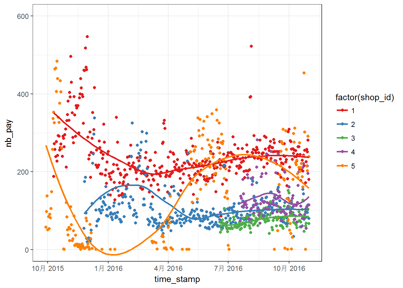
First, let us make some figures using off course ggplot2. Plots for first five shops:
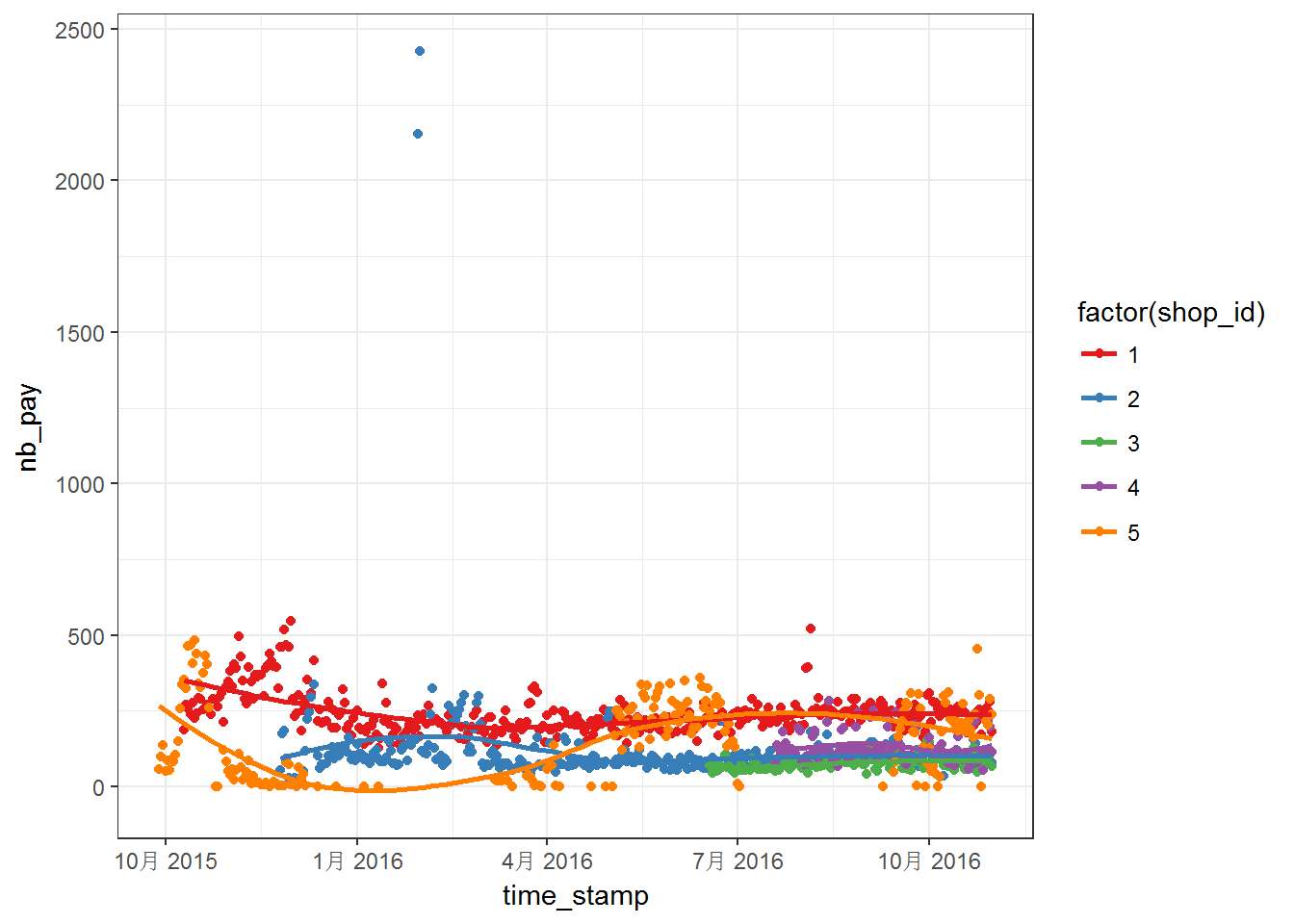
Above two figures are quite messy. We can notice that the data have different range, which means that we may have to worry about NAs. Moreover, most of the series do not steady in the given range. For these five curves, the curves are more steady after April 2016. Then, above series are plotted into separated panels as follows:

p <- ggplot(tc2017 %>% filter(shop_id<6),aes(time_stamp,nb_pay)) +
  geom_line() +
  facet_wrap(~shop_id, ncol = 1, scales = "free")
print(p)
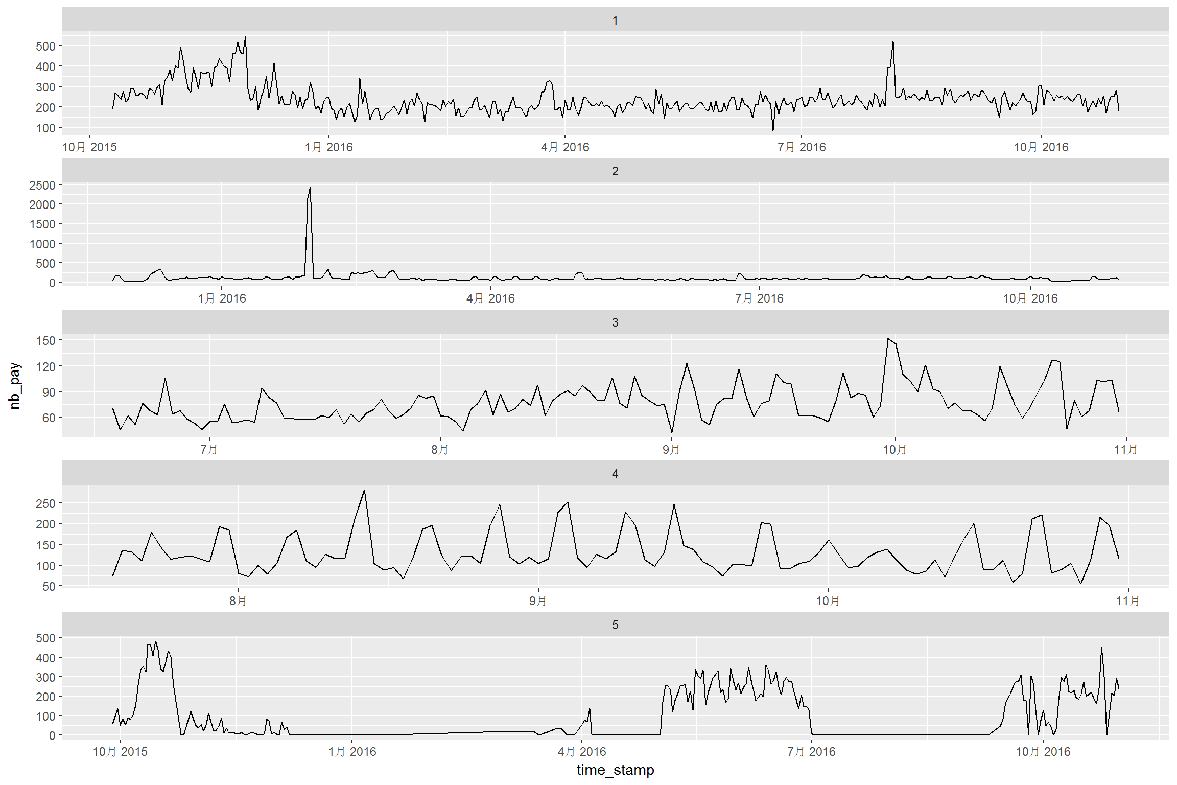
Some series have strong seasonal feature, such as curve for shop_id==4. We may need to consider the seasonal effect. A quick acf drawing is shown as below:

acf((tc2017 %>% filter(shop_id==4))$nb_pay)
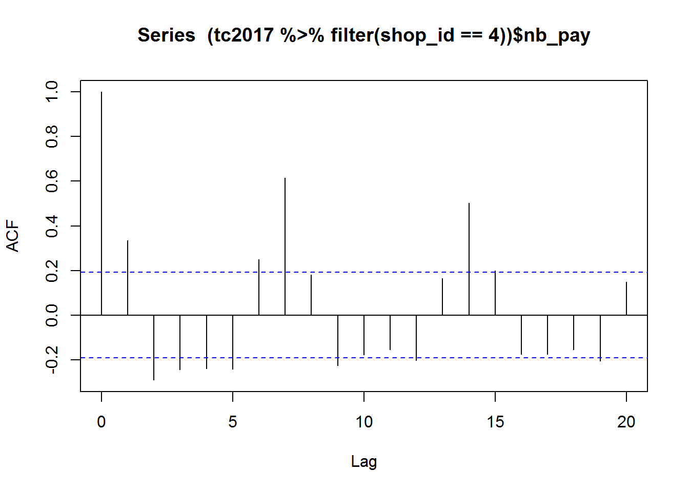
It can be observed that the periodic pattern is quite clear, the period is 7 and it is the length of one week. Therefore, we plot the data against the weekday:

p <- ggplot(tc2017 %>% filter(shop_id==4),
            aes(time_stamp,nb_pay)) +
  geom_line(size=1) + 
  facet_grid(date_week~.,scales = "fixed")+
  theme_bw()
print(p)
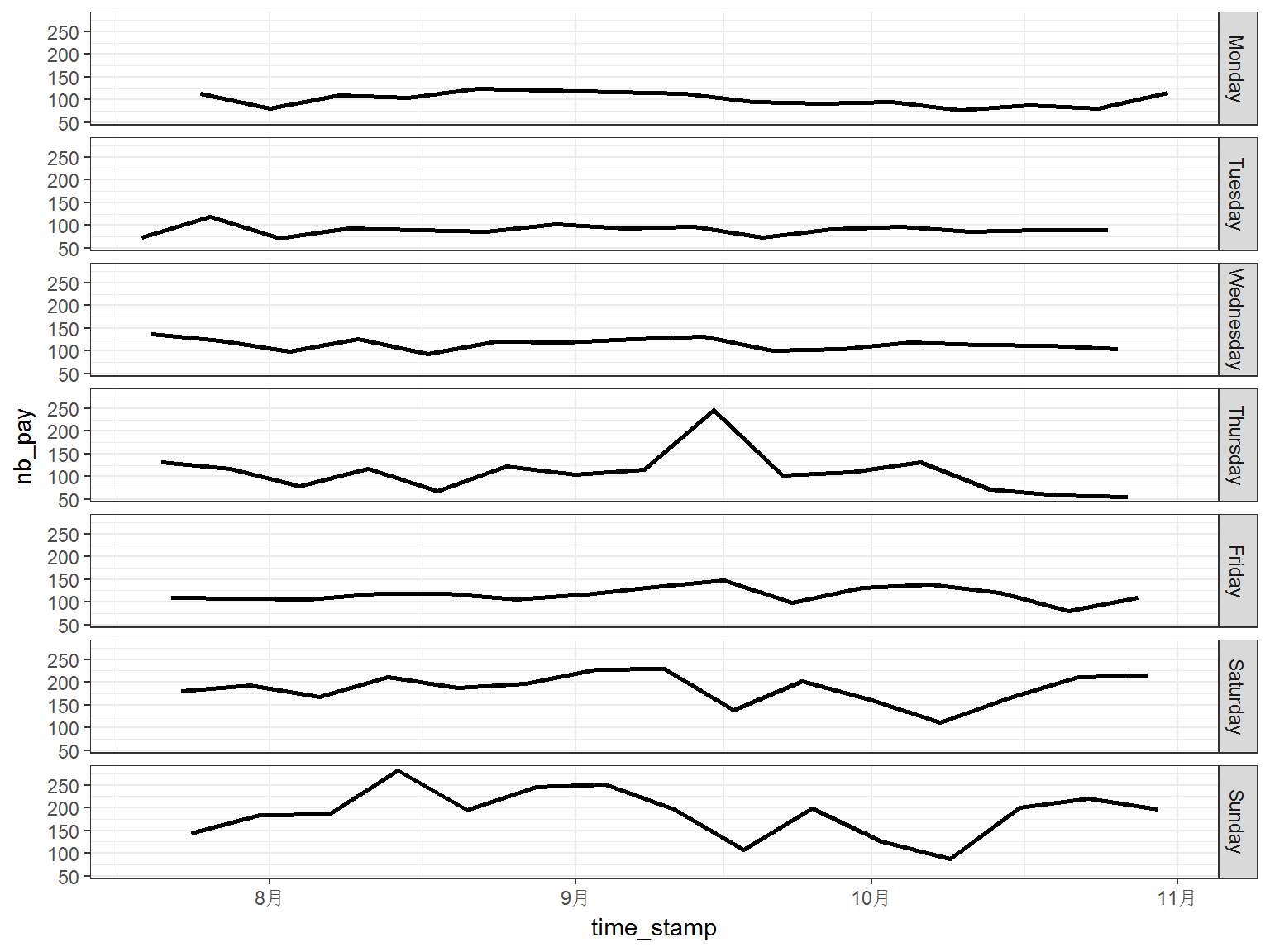
It is shown in above figure, the number of customs is much steady when we investigate the flow on the same weekday. This pattern also appears in the data of other shops.

p <- ggplot(tc2017 %>% filter(shop_id<6),
            aes(time_stamp,nb_pay,color = date_week)) +
  geom_line(size=1) + 
  facet_grid(date_week~shop_id,scales = "free")+
  scale_color_brewer(palette = "Set1")+
  theme_bw()+ theme(legend.position = "none")
print(p)
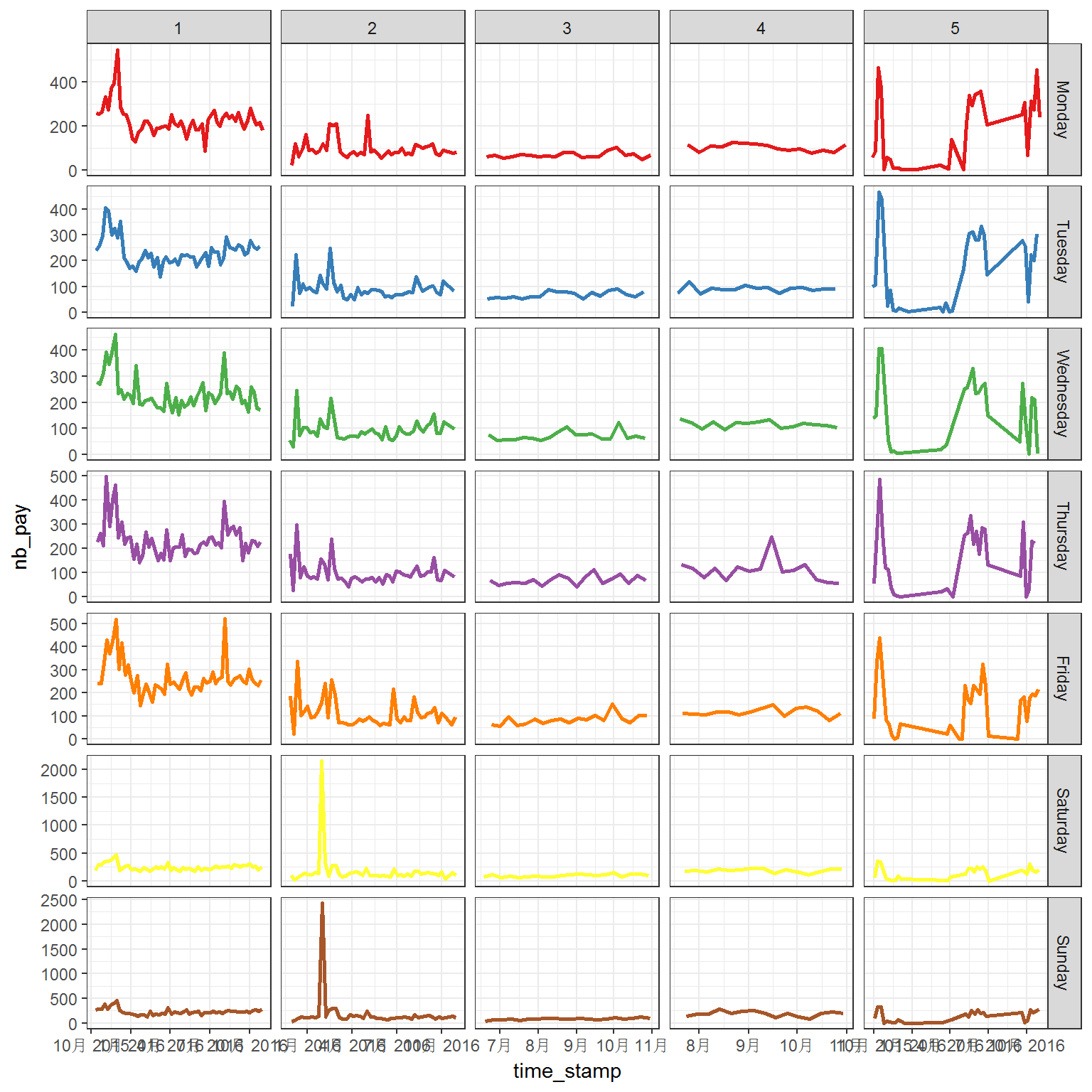
Generally, the flows have quite different patterns between weekdays and weekends. However, the longtime trend also plays important role in the flow.

Let's make some predictions here:

library(forecast)
library(xts)
to.ts <- function (x) {
  ts(x$nb_pay,frequency = 7)
}

新加坡LTA的增强JSON API

本文转载自新网站同名文章:https://whyhow.github.io/2016/04/07/ltaapi.html

昨天的文章提到了LTA官方的API的JSON接口,今天增强了一下API的功能,定义了JSON版本API的增强版。接口如下:

新加坡LTA的JSON API

本文转载自新网站同名文章:https://whyhow.github.io/2016/04/05/ltaapi.html

新加坡的公交数据当然由LTA公布,官方有接口,对于网站来说很方便。如果直接做网页的话,有些时候还是json的api比较好用,所以我就山寨了一个,把LTA的公交到站数据直接转换成了JSON格式(感觉其他一些数据咱穷人也不关心)。项目托管在GAE上,有兴趣使用的读者可以测试一下,不过可能受到GAE每天的额度的限制不一定好使哦。

新加坡NEA的JSON API

本文转载自新网站同名文章:https://whyhow.github.io/2016/04/05/neaapi.html

新加坡的天气数据由气象局公布,官方有XML的接口,做得其实很好了。如果直接做网页的话,有些时候希望是json的api,所以我就山寨了一个,把NEA的XML数据直接转换成了JSON格式。项目托管在GAE上,有兴趣使用的读者可以测试一下,不过可能受到GAE每天的额度的限制不一定好使哦。